


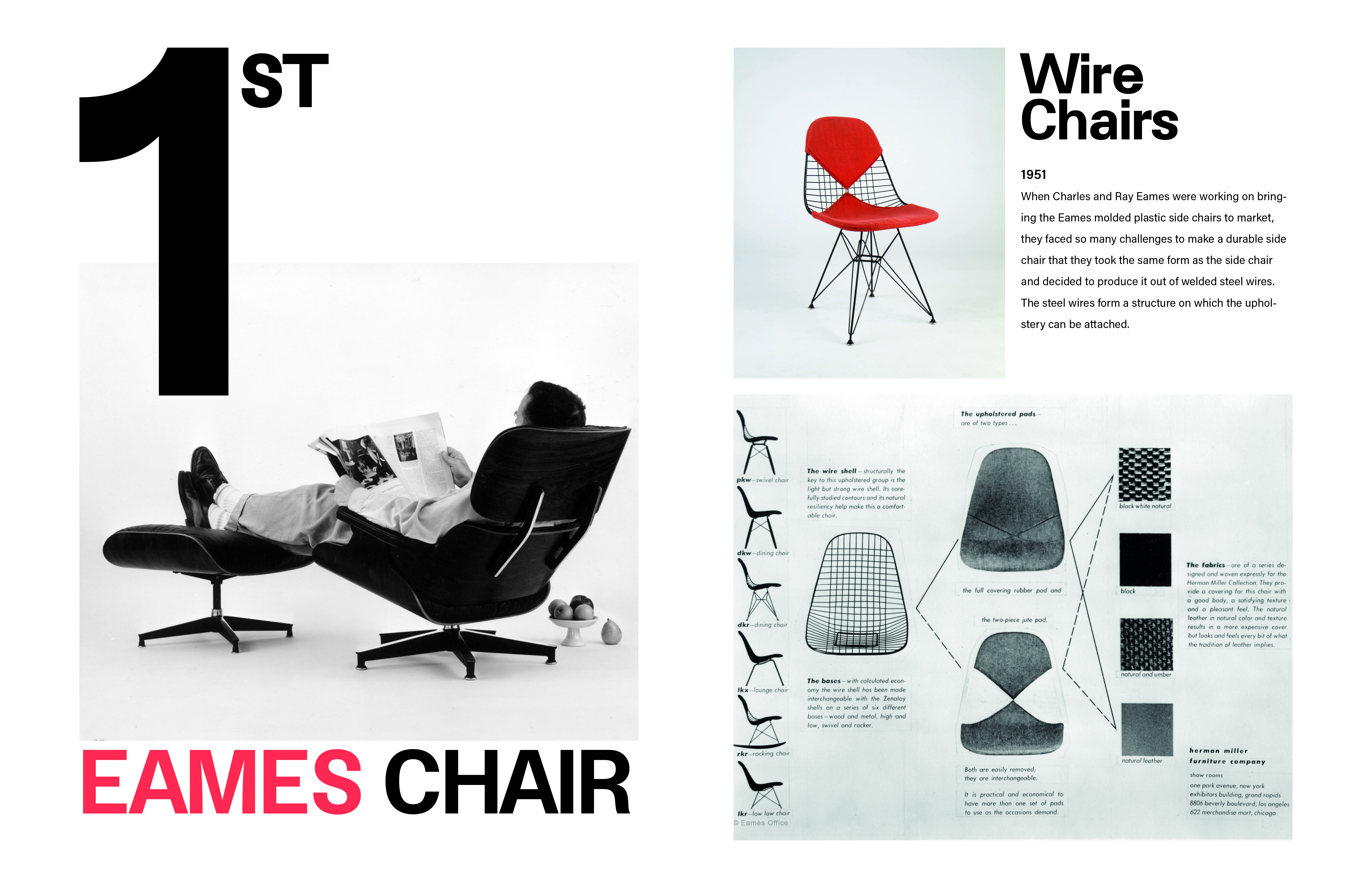
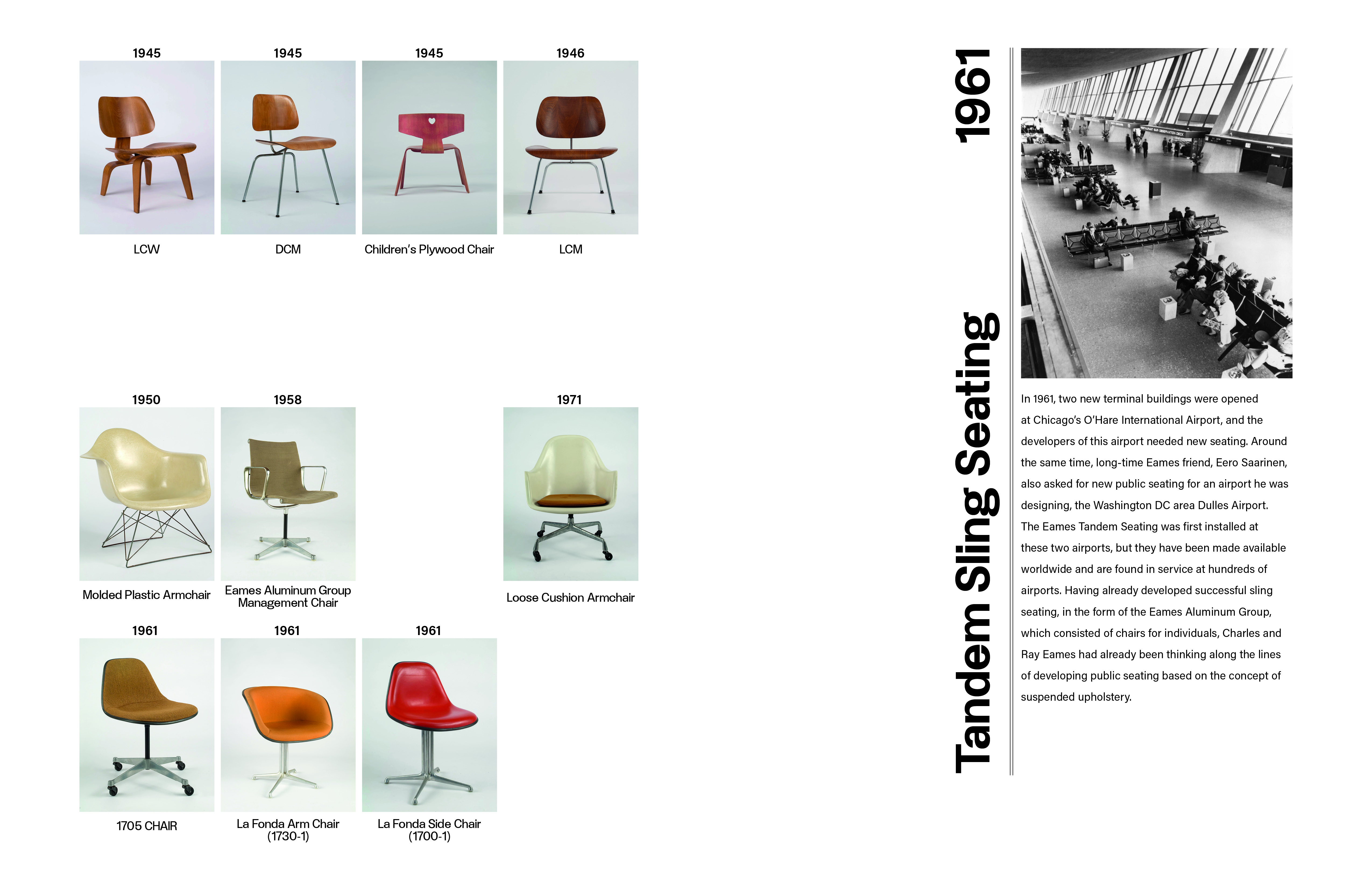
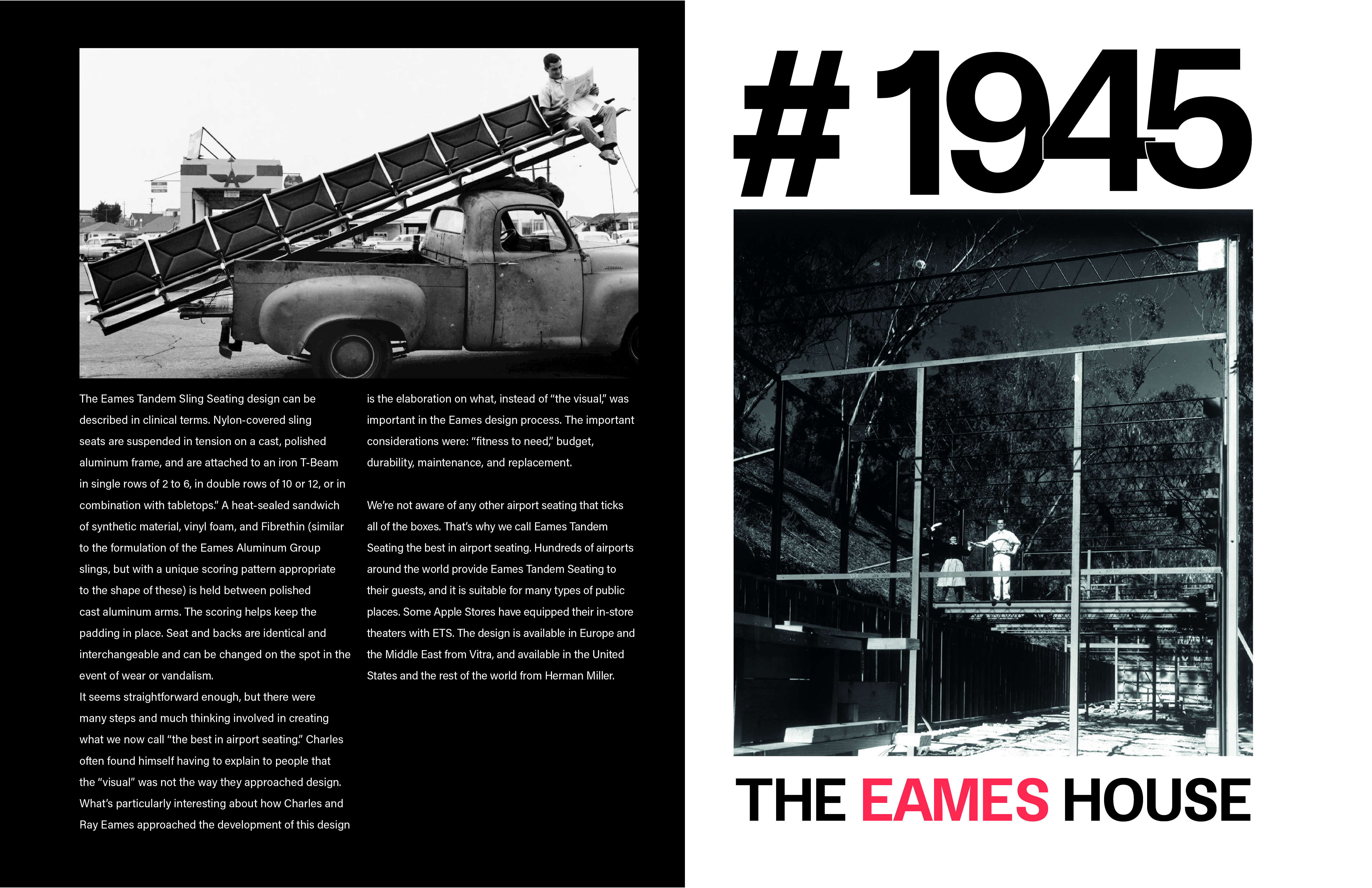
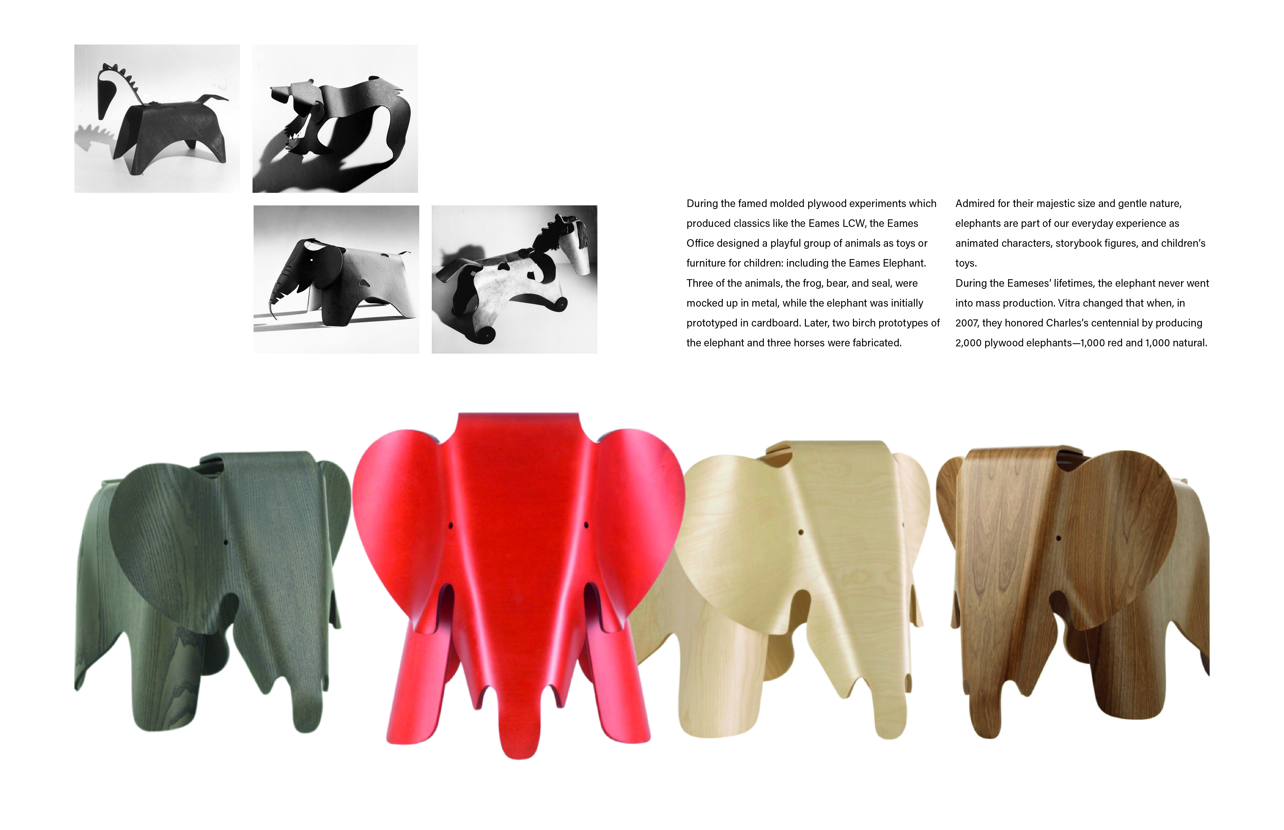
Love By Design
Editorial Design
This project adds emphasis to the typeface we choose. First, we needed to select an artist as the topic of our book, and the font should have some connection with the artist. Since the outcome must be a French fold book, it’s also important to explore the form of the French fold in our design.

Type Choice
I chose Charles and Ray Eames as my topic and selected a font named “Werk.” Werk Sans was published on January 1st, 2015, by Turlytype. Inspired by mid-century architecture journals, the font reflects the spirit of that era. It combines geometric design’s lightness and mathematical precision with a touch of humanistic shine. This style resonates with Charles and Ray Eames, who were prominent figures of the mid-century period. The typeface is clean, simple, and geometric, aligning well with the Eames’ minimalist and mass-production design ethos.


French fold design


View spreads
Love By Design
Editorial Design
This project adds emphasis to the typeface we choose. First, we needed to select an artist as the topic of our book, and the font should have some connection with the artist. Since the outcome must be a French fold book, it’s also important to explore the form of the French fold in our design.
Type Choice
I chose Charles and Ray Eames as my topic and selected a font named “Werk.” Werk Sans was published on January 1st, 2015, by Turlytype. Inspired by mid-century architecture journals, the font reflects the spirit of that era. It combines geometric design’s lightness and mathematical precision with a touch of humanistic shine. This style resonates with Charles and Ray Eames, who were prominent figures of the mid-century period. The typeface is clean, simple, and geometric, aligning well with the Eames’ minimalist and mass-production design ethos.
French fold design
View spreads
tsechunhsu@gmail.com
tsechunhsu@gmail.com
tsechunhsu@gmail.com